With expert insight from Farrow & Ball, discover gorgeous paint colors and ideas for a 2023 kitchen refresh
Words By Miranda Valentine
Kitchens-obsessed group that we are, the collective question around the Decor Maine office has been this: Which paint colors would be especially divine for kitchens in 2023? Luckily for us, we had the good fortune to ask the opinion of world-renowned color consultant and Farrow & Ball International Brand Ambassador Patrick O’Donnell. Read on for his fail-safe, chic color recommendations for the heart of your home in 2023 and beyond.
A freestanding painted
element, like this cup
-
board, brings color and
depth to an otherwise
neutral room.
Patrick O’Donnell shares which paint
colors pull a kitchen together.
“Kitchens for many of us are the most expensive rooms in the home to fit and decorate, so it’s vital to get it right in this multifunctioning space, which is not only a place of cooking but often gathering of family and friends for shared conviviality! With all of these elements in mind, the colors we choose for walls and cabinetry can play a huge part in the overall success.
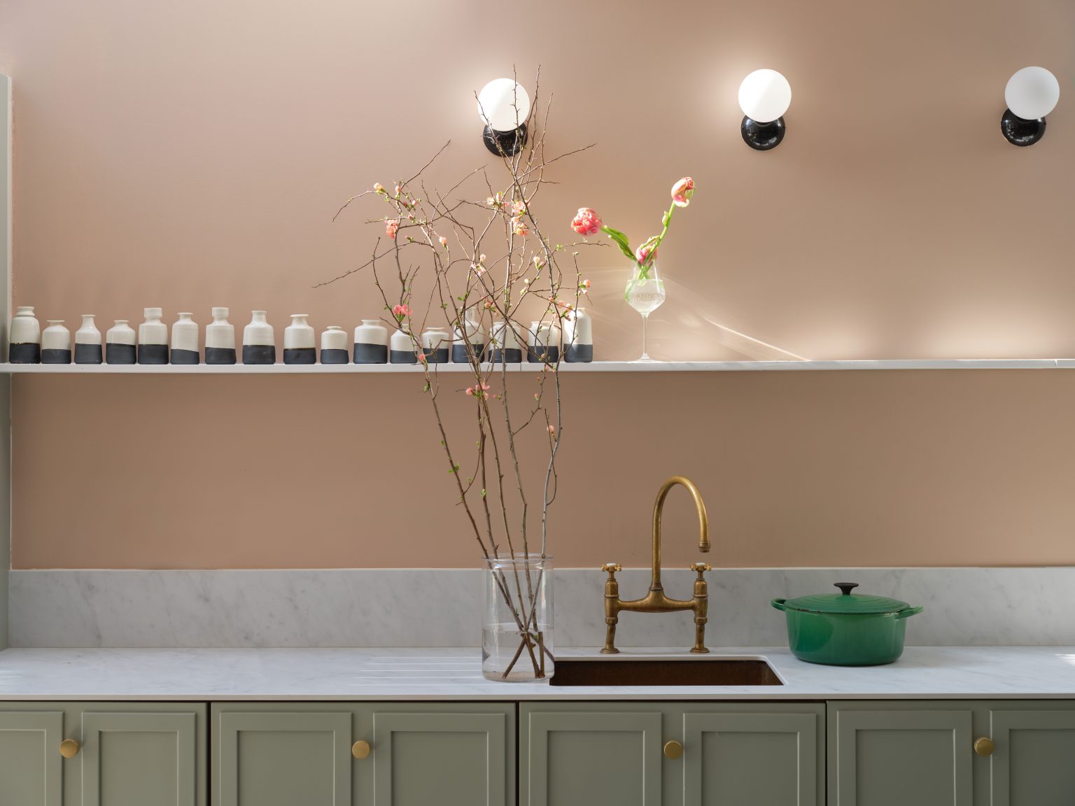
“Earth-toned pinks are a great choice. Yes, you heard me—pink kitchens, but not Barbie pinks. Something much gentler and more flattering. ‘Templeton Pink’ will bring gentle warmth to any space but especially to rooms that aren’t blessed with abundant natural light—think east facing (morning light) or north facing (little natural light)—but will also emit gentle warmth whatever your room aspect. Do make sure the finish of your paint is also fit for purpose—for example, Modern Emulsion for your walls (washable and wipeable) and Modern Eggshell for cabinetry and trim, the perfect choice for a busy, working household.
Whirlybird
No. 309
Templeton Pink
No. 303
Beverly
No. 310
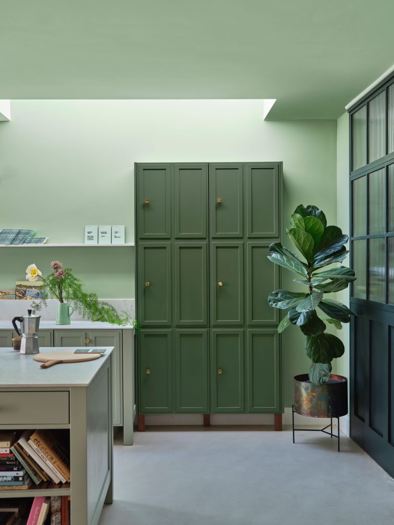
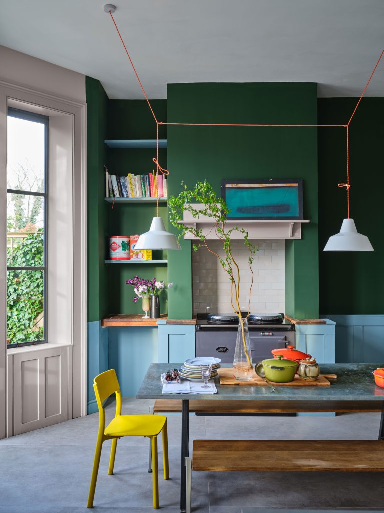
For those
seeking contrast, a deep green juxtaposed with
a lighter blue makes for a playful kitchen.
“Play with color families: Layer blue on blue, green on green, but in different intensities for a harmonizing scheme that is anything but bland. Try the delicate and fresh mid green of ‘Whirlybird’ on your walls and cabinetry (different finishes, naturally!). This is especially good if your kitchen is small, as a controlled palette will help the room from feeling too small, but bring in a complementary accent of a deeper green such as ‘Beverly’ on any freestanding furniture, such as a larder cupboard or even a kitchen island.”
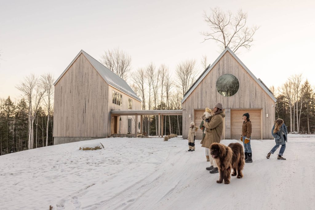
With antiques, texture, and a taste for the unexpected, designer Emily Rand of A Visual Pursuit brings whimsy and playfulness to a family farmhouse in New Gloucester