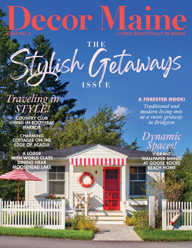
Can it be possible we’ve reached fall again? It must be the case, because once more it’s time to tip our hats to the 2023 projects that had us smiling, rethinking, looking closer, and sometimes flat out shaking our heads in wonder. What stands out as we reflect on this year’s honorees is the extent to which—almost to a one—these projects succeed by doing the opposite of the norm, by stepping off the familiar paths and finding their own. A traditional Mount Desert Island camp got reinterpreted as a modern solarium. One kitchen remodel opted to add walls rather than demolish them. Instead of sinking into a slump, one pair of empty nesters revamped their home for partying—including the addition of a wet bar and smoking deck. (Sorry kids, we can’t come to the phone!) The point is: the design pros featured here acted boldly, gave fresh takes and new ways to buck expectation. We’re all for more of that in the coming year! In 2024, because that’s how it’s always been done is no longer an acceptable answer.
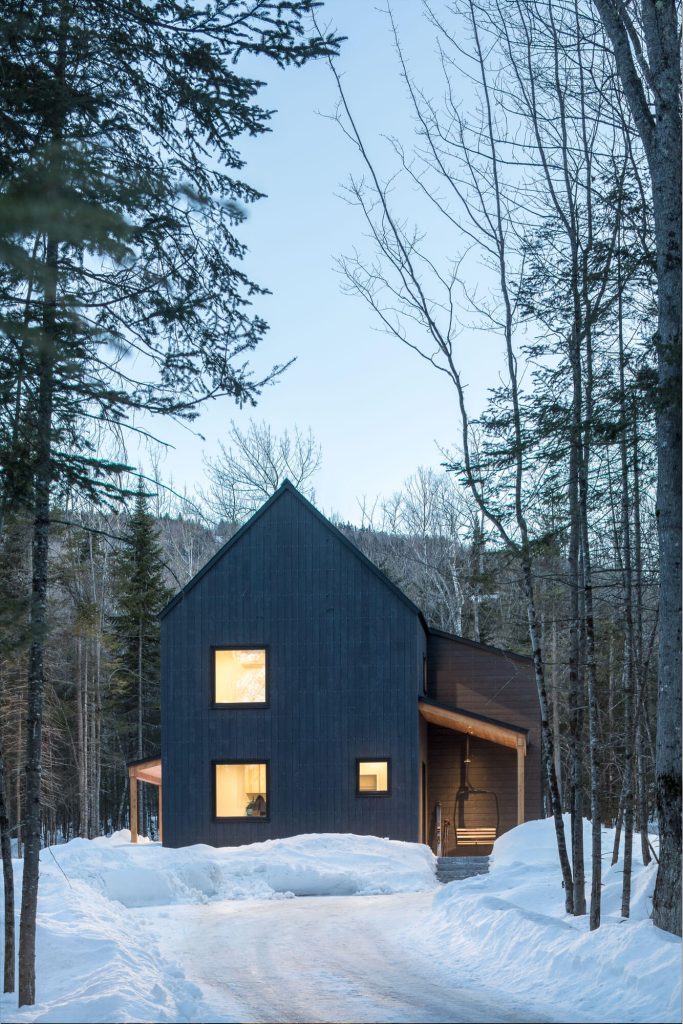
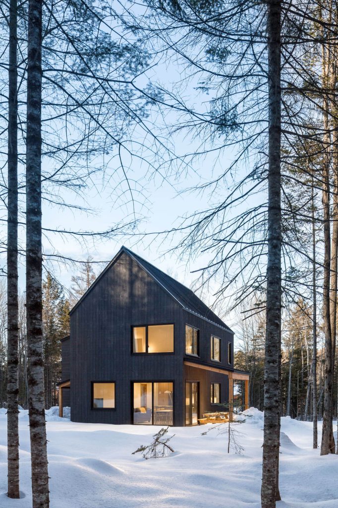
The Wild East
Harbor Point by Woodhull
On a slenderly inhabited island, chic design endures nature’s beating
Location Phippsburg, ME
Engineer: Becker Structural Engineers | Windows: Pinnacle Window Solutions | Photography: Trent Bell
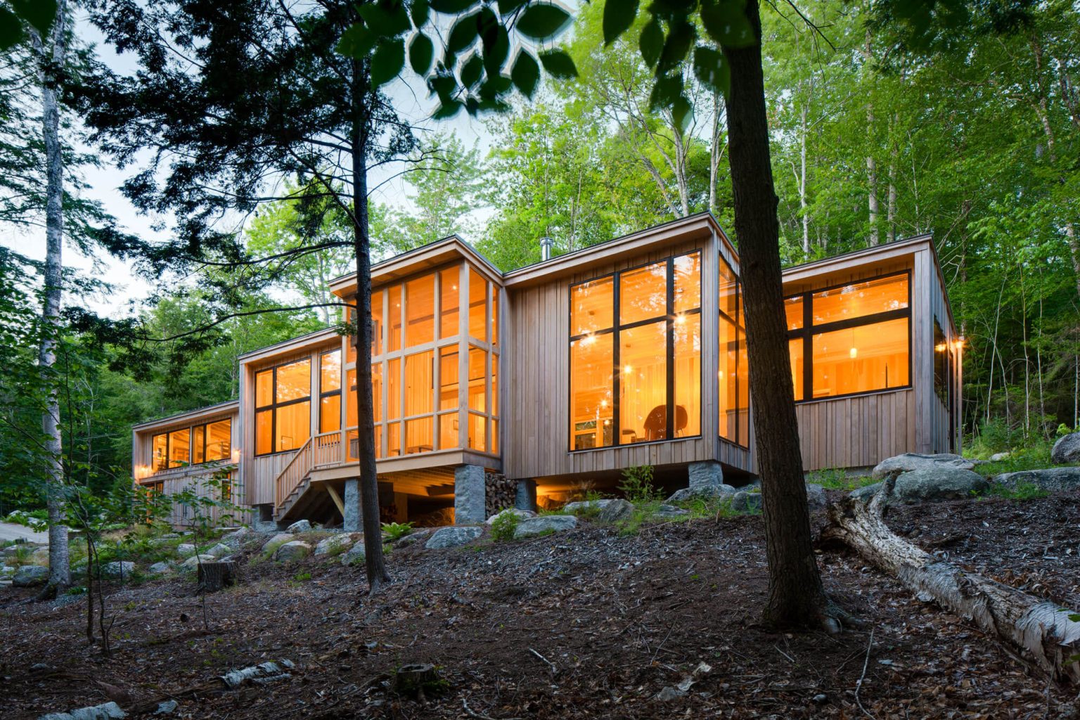
Elemental is the word David Duncan Morris returns to again and again when describing his team’s work on this two-structure compound situated on a radically exposed finger off the coast of Phippsburg. “The wind and water are very much a part of the experience on this property,” he says. “The erosion, the glacial recession that occurred however many thousands of years ago, is all still there. It’s a very wild place.”
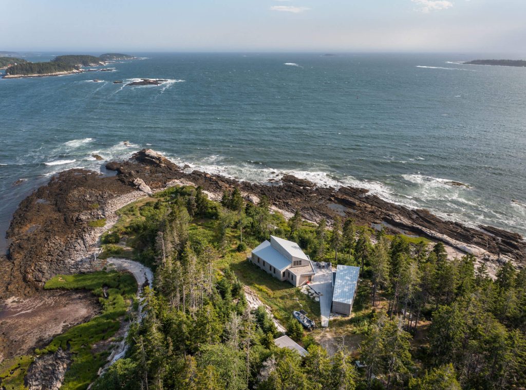
Such wildness affords mind-massaging vistas, to be sure, “But it’s also something to contend with,” says David. “The views are expansive, but when you’re out there, you’re also seeking protection. This house needed to do everything a house does, while also withstanding anything Mother Nature might conjure.”
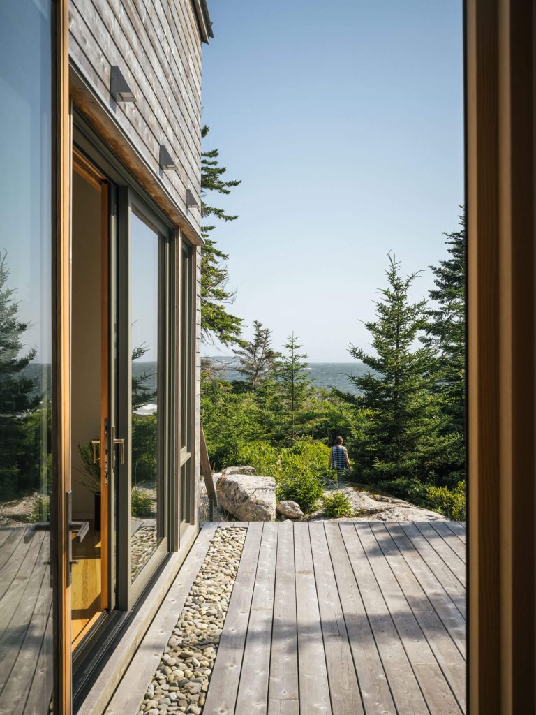
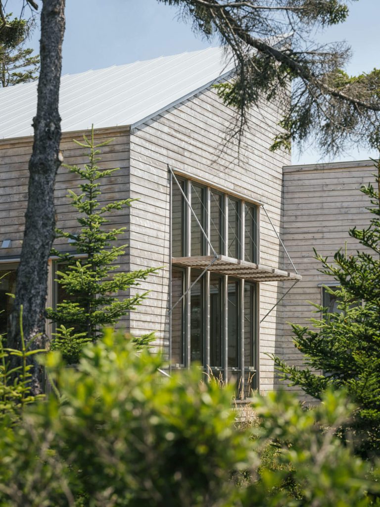
The spare design, edging on utilitarian, has an elegance meant to meld with the environment. The roofline slants mirror the striations of rock (cut by glaciers!) along the waterline. The spare material palette—glass, metal, and unfinished eastern white cedar—was selected for its durability as well as its minimal maintenance requirements. The island has no roads, and the property is a quarter-mile walk from the only dock. “This is not a place you can easily repaint,” David says.
The compound consists of the main two-bedroom home, a seasonal guest house (not a lot of takers in winter), and a central deck radiating toward both structures. “We tried to remove everything unnecessary,” David says. “For example, the deck has no rails. It’s essentially a platform. One step off and you’re on untamed coastal rock.” Each element of the property sits on concrete piers, floating five feet above the natural landscape in places, allowing water, vegetation, and wildlife to pass freely beneath. “There was no landscape architect on this project,” David says. “We wanted the island’s natural plant life to grow right up against and under this place. Often, we’re trying to prescribe an idealized version of the landscape, but this was very much about putting a building down and not prescribing anything—letting the earth do what it does, and living with that. We tore up the site a little while we were building, but nature took it back real quick. That was the point.”
Inside, ocean views find every window. “The view is the art,” David says. In the living room, crossed framing jambs on a vertical window wall offer one of the project’s few, albeit carefully considered, aesthetic flourishes. “Because the house is not overly stylized, we did bring in some subtle moments of elevated refinement. We shaped the wood on those vertical and horizontal pieces to get a bit of shadow when those planes catch the light.” Although, David admits even this fine touch had its roots in contending with the locale. “The fact is, that window takes a gargantuan wind load, and we needed those thick jambs for structure. We wanted to provide a bit of elegance, of course, but they were quite necessary.”
A Nest Not Long Empty
With their kid off to school in Boston, these homeowners were looking for a revamp—to reimagine their home of twenty-plus years for the next phase of life, one they hoped would include significant time spent hosting friends and family. “They love to have people over,” says Samantha Pappas, “We wanted a space that made that easy and fun. Every surface was touched during this project.”
In the main house, this involved ditching a cramped pantry (used mostly to house a furnace chimney), a small sitting area, and laundry closet in favor of an open plan. “[Before], it felt small, without a truly inviting place to gather,” Samantha says, but tinkering with the layout not only fused the kitchen and dining room, it lent space for what they began calling the “coffee lounge,” a space in which it is not hard to imagine enjoying the confidence of a good friend over a morning cup.
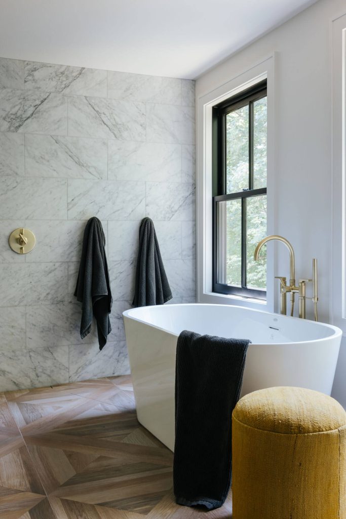
The real show, however, is above the garage, where Samantha turned a blank space into a magnificent entertaining room. “This was completely new,” Samantha says, “but it feels like it should have been there all along.”
The addition includes a wet bar, multiple seating areas, game table, a small deck (in case someone wants to step outside to enjoy a cigar), and even a full bath, allowing the space to double as an extra guest room if needed. “It’s definitely the heart of the home,” Samantha says. “It also combines many of the design styles and elements from throughout the house.”
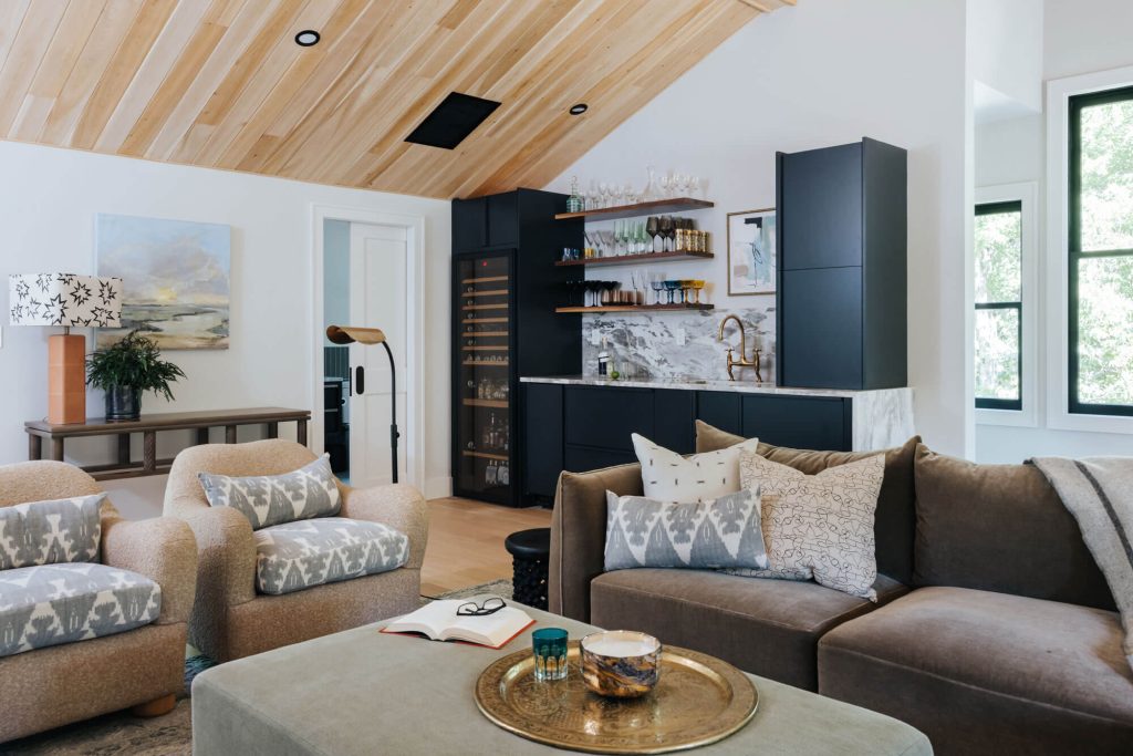
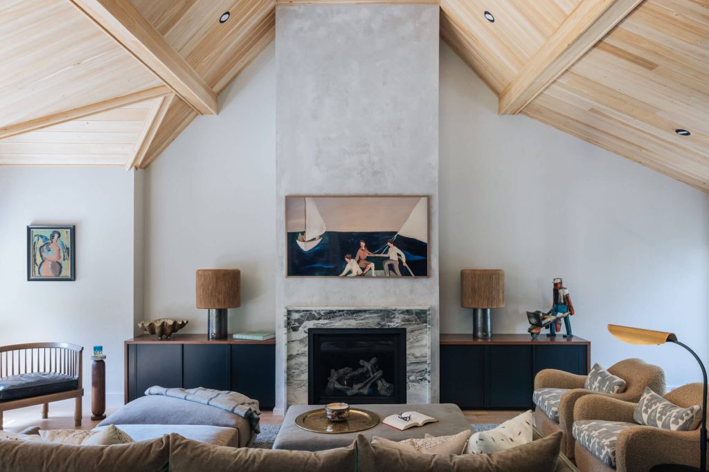
The finishes here are remarkable, starting with the wildly dramatic vaulted cedar ceiling. “The wood adds an organic element. It draws the eye up, then back down to other features of the room. I just knew a sheetrock ceiling wouldn’t give the same feeling as wood,” Samantha says. (Note the chimney wall finished in Venetian plaster.) The movement in the plaster plays deliciously with the marble fireplace mantle. Samantha uses the same marble on the wet bar to hold the space together. “I love mixing textures,” she says. “Pairing natural woven window treatments with the marble and wood brings those natural elements inside. Looking at each layer on its own [either color, pattern, or texture] they may appear random, but when it’s all pulled together in a room you notice the common threads and how it all makes sense.”
A mix of found and commissioned artwork completes the space. A piece above the wet bar by Florida artist Laura Patrick lends modernity while incorporating not only the appropriate color scheme but some of the marble’s motion. “These pieces are specifically placed in areas where they bring out key elements of the design,” Samantha says. For example, the piece over the game table—Wild Plant Bubble Vase by Elizabeth Endres—imbues a sense of playfulness. “This is a cool, easy-going couple,” Samantha says, “and I want every element to reflect that.”
Sustainable Skiing
Slopeside Retreat by Kevin Browne Architecture
Deep insulation keeps a family ski lodge high-performing and highly energy efficient
Location Greenwood, ME
Builders: Winterhaven Custom Builders | Structural Engineering: Structural Integrity Consulting Engineers | Photography: Jeff Roberts
A crash course for context: The R-Value of a home is a measurement of how well the structure is insulated and, by extension, how energy efficient in terms of heating, cooling, and air circulation. The higher the number, the greater the insulation. For reference, the state of Maine requires a code minimum of R-21 in all new residences. But at this Mount Abram ski retreat (“You can literally ski off the mountain and right in the back door,” says architect Kevin Browne), designers utilized the latest in green materials, technologies, and sustainable construction methods to build the client a high-performance home. The R-Value for the walls came in at R-38; the roof at a staggering R-68.

“It requires a different kind of building,” Kevin says. “The wall system is not a standard studs-and-drywall system. There are a lot of barrier layers. There’s insulation sandwiched in the middle, air barriers, and vapor barriers to help give a continuous seal. Every joint is wrapped like a present. The craftsmanship our builders pulled together here is a work of art.”
With all that sealant, energy recovery ventilators ensure a controlled exchange of air each hour, not only preventing stale, stuffy air (the air quality is actually better than a traditionally built home) but preserving the air’s temperature as well, significantly reducing energy load and cost. Triple-pane Logic Windows provide additional sealing along with the additional benefit of sound-proofing.
“Yes, these products and methods do cost a little extra,” says Kevin, “but I tell clients all the time, ‘Spend your money making sure the shell of the house is done right, because it’s going to be way more expensive and harder to do later, as opposed to changing your kitchen or updating a room.’” Besides, isn’t safeguarding our planet worth the cost?
New Eyes on Quahog Bay
Bethel Point by Kevin Browne Architecture
A midcentury relic gets delightfully reimagined for water views
Woodworking: TJ’s Fine Woodworking | Landscape Design: Soren Deniord Design Studio | Interior Design: LKW Design Associates | Structural Engineering: Albert Putnam Associates | Photography: Kimberly Gavin
“We called the original house on the lot the ‘stinky house,’ before we tore it down,” says Kevin Browne. “It was built in the 1960s and hadn’t been used in a while. The basement was really wet, and frankly, it didn’t smell too great.” Perhaps more egregious than the smell was the fact that the original structure failed to maximize views of Quahog Bay, surrounding the property on three sides. “Some of the rooms were really cut off,” Kevin says.
However, zoning restrictions were tight. Grandfathered in for non-conforming use in a commercial fishing zone, the new home, as mandated by the town, could expand no more than 30-percent in volume and square footage, requiring it to sit in the footprint of the original. With no room to go wider, Kevin decided to go vertical. “We essentially added a second floor,” he says, “including the primary suite and a patio overlooking the water.”
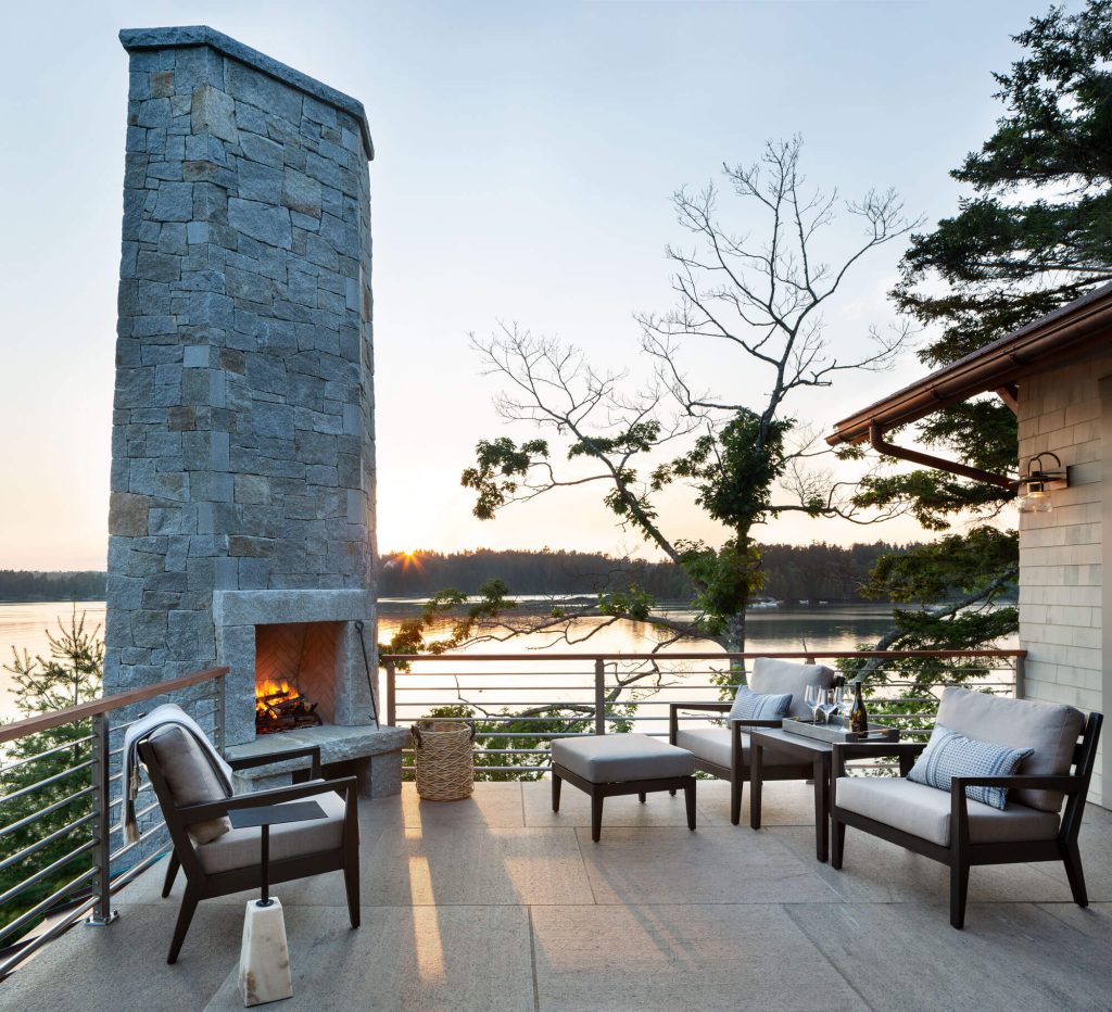
The stunner here, of course, is the stand-alone chimney. “That was a key anchoring point of the whole design,” Kevin says. “I was hesitant at first to have it so free, but it’s very well anchored, and the tapering, I think, helps it not feel too tall.” Hundreds of individual pieces of Maine granite—hand-cut by Standish mason Isaac Labbe—comprise the near-twenty-five-foot column. “Isaac is one of the best,” says Kevin.
At the chimney’s base, the living room windows go right up against the stone, again maximizing sightlines to the water. “It’s always a challenge in a living room,” Kevin says, “because you’re trying to balance the fireplace, the TV, and the view. In this case, we didn’t want our backs to the water, so the fireplace had to be in that corner location.” On the patio above, the chimney opens into an outdoor fireplace, perfect for warming one’s hands and feet as the sun sets over the bay. “With the chimney in that position, we were able to consolidate the two fireplaces, one on top of the other,” Kevin says.
Proximity to the water also required that environmental accommodations be made. “On all our projects, we think about how water hits the building, and the longevity and sustainability of materials used,” says Kevin. At Bethel Point, this included a drainage plain behind the exterior siding. “For maintenance and long-term replacements, we made sure the siding has air flow behind it,” Kevin says. “We also exaggerated the roof overhangs to shield from the elements, and shade the interior during the summer months. A low-pitched roof also helps ground the house, lets it blend in with the site a little better.”
On Your Mark...Get Set...Modernize
Beach House by Nicola’s Home
Nicola’s Home finds a million clever solutions while enacting a full refresh
Cabinetry: Derek Preble Cabinetmakers | Paint Chameleon Coatings | Flooring: Casco Bay Hardwood Flooring | Photography: Sean Litchfield
We independently review everything we recommend. When you buy through our links, we may earn an affiliate commission, at no cost to you.
To hear the parameters of this extensive modernization is like listening to the rules of a thrilling design gameshow: Take a fixed budget, a three-month deadline, and modernize the full interior of this gambrel-style beach house. And, oh yes, two more things: the client wants no involvement until the reveal, and the work must be done during a global pandemic. Go!
To this task, Nicola Manganello of Nicola’s Home brought her considerable skill, depth of knowledge, and experience. “The client was key,” says Nicola. “Having their trust allowed me and my team to get really creative.”
Supply chains were jammed, and lead times for custom upholstery jobs were touching on upwards of a year. Nicola had to dig deep from her bag of tricks and contacts, repurposing much of the existing furniture with the help of local upholsterers; focusing on fast-ship items; and favoring Maine artisans, fabricators, and sources at every turn. The results are jaw-dropping. (Spoiler alert—the client loved the work!)
Throughout the home, Nicola started by wash treating the Douglas Fir flooring, staircases, and door slabs. “It definitely gave a beachier feel,” says Nicola, “Then we painted all the trim white.” A chemical treatment was also used on all door hardware and hinges. “We kept the original doorknobs but darkened the hardware to look more modern,” she says. Light switch casings went from almond to fresh white—”It’s a small change that really freshens the entire interior,” Nicola says—and lighting fixtures throughout were replaced with an eye for texture.
Then came the really dramatic embellishments. A solid oak dining room table from online marketplace 1stDibs, as well as a dining room chandelier, became early drivers of the project. “It was the first thing we bought,” says Nicola. “It came as a raw wood table, and our cabinet maker Derek Preble stained it to match the new upper cabinetry [in the kitchen].” Grass cloth on the walls added texture. “It’s a softer, more subtle way to modernize a room,” Nicola says.
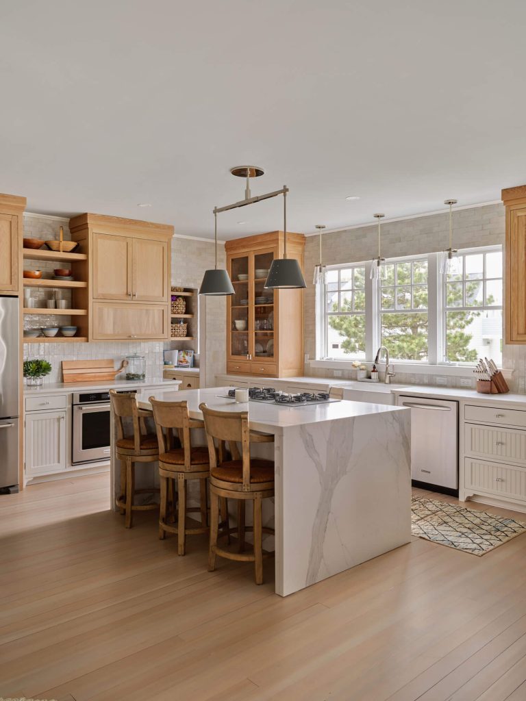
But it is her work in the kitchen (to our minds) that evinces the true extent of Nicola’s magic. A coat of paint refreshed the lower cabinets, but the upper cabinets left roughly an eighteen-inch gap between their termini and the ceiling. “That was wasted space just collecting dust and dirt,” she says, so Derek constructed new uppers in whitewashed oak that extend all the way up. “We waterfalled the kitchen island in Calacutta Extra quartz, brought in a farm-style sink (to replace a stainless steel undermount), took down cabinets in the pantry, and added open shelving to make it feel bigger,” Nicola says.
Our favorite finish is the handmade Moroccan Zellige tile. Note how it runs all the way to the edge of the pantry entrance, which has been stripped of molding. “A small action that makes a big impact toward modernizing,” Nicola says. “Same with the way the tile is placed both vertically and horizontally. Those little touches make a significant impression.”
What we wouldn’t give to have been there for the reveal!
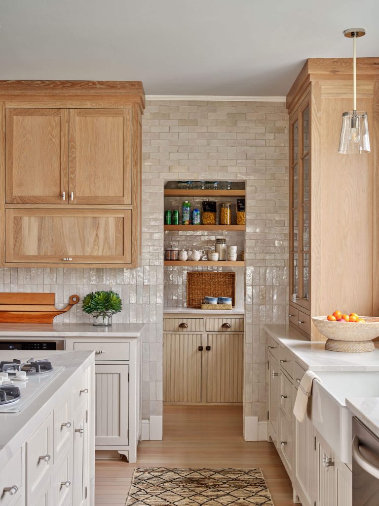
Kitchen’s Closed
Small House, Big Kitchen by M.R. Brewer
M.R. Brewer makes unexpected moves on this Scarborough kitchen layout
Location Scarborough, ME
Stone & Quartz Supplier: Surface Creations of Maine | Tile: Capozza Floor Covering Center | Photography: Liz Daly
Most Maine capes are a series of compact, interconnected rooms, and the first order of business for most renovation projects is to open things up, especially in the kitchen, a space traditionally cut off from the rest of the home. “We’re always taking down walls,” says Tavia Douglass. “But in this case, we actually added a wall to the kitchen. It’s almost unheard of these days. We took an open plan and closed it in order to get the clients more cabinet storage, which they desperately needed.”
By repurposing an underused bedroom into a laundry/bathroom, it made it possible for them to add a mudroom adjacent to the kitchen, while maintaining the additional kitchen wall (the client’s daughter is an avid baker and relies on a wall oven). “It doesn’t feel like it was ever separated,” Tavia says. “It feels very natural to the home. Plus, we were able to get them a space for small appliances and for more storage.”
Notice, too, the interplay of color. The matte white oak finish on the island cabinets and oven hood was made to live next to that “Caldwell Green” by Benjamin Moore. “We also ended up using a single-style drawer pull in two finishes, one brass, one black,” says Tavia. “The brass worked wonderfully on the green, but it was getting lost on the oak. By using the same hardware in black we were able to achieve that high contrast while keeping the kitchen feeling cohesive.”
We’re also loving the decision to eschew traditional row seating at the island for a more tablelike, face-to-face arrangement. No more leaning back and forth to hear what’s going on at the other end of the counter!
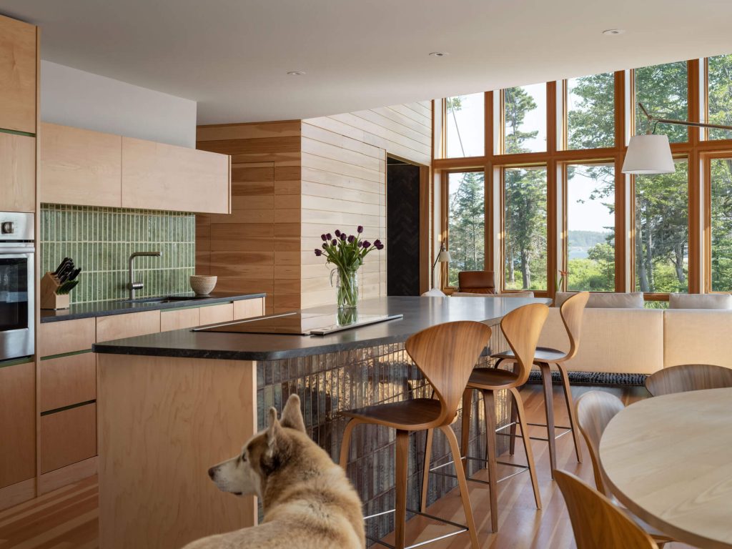
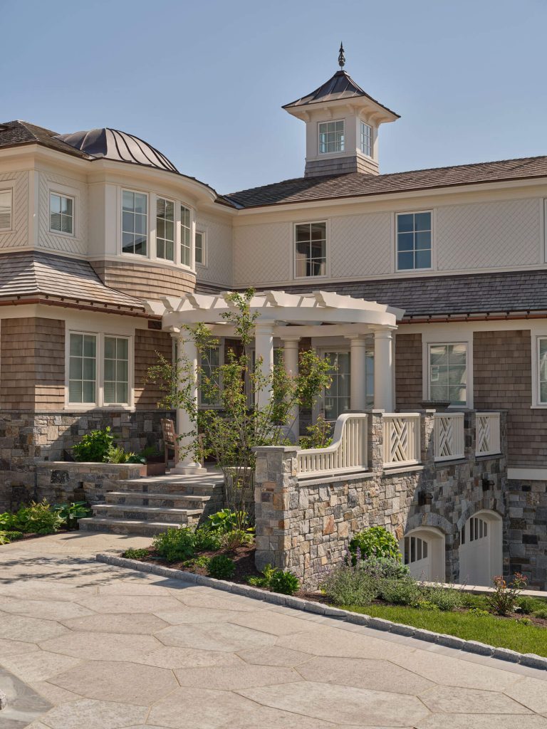
CAMP LIFE: This Century and Next
When one pictures the quintessential lakeside camp on MDI, chances are the image of this ultra-modern, solarium-like knockout does not come to mind. But a deeper dive reveals the extent to which William M. Hanley, AIA and Heli T. Mesiniemi, AIA, and the team at WMH Architects went to evoke the beloved, time-tested qualities of those more traditional structures. “Our heads—we like to think—are aimed forward,” William says, “and it seemed there had to be a way to embrace the traditions of the Maine camp vernacular, but to incorporate them into a more modern-languaged home.”
For instance, on most older structures, the original builders felled trees on site for their materials. Strict conservation easements on this estate (managed by Acadia National Park) prevented such a clearing. Still, notice the siding. “On those traditional camps you have trees of all sizes and thicknesses used, because it was whatever happened to be there,” says William. “We were really inspired by that.” The siding here is all Alaskan yellow cedar—but see how the exterior undulates with depth and shadow and relief. William: “We worked hard with [contractor] Al Jensen to achieve that interplay of random thicknesses and widths. We interpreted traditional camp siding into a contemporary expression.”
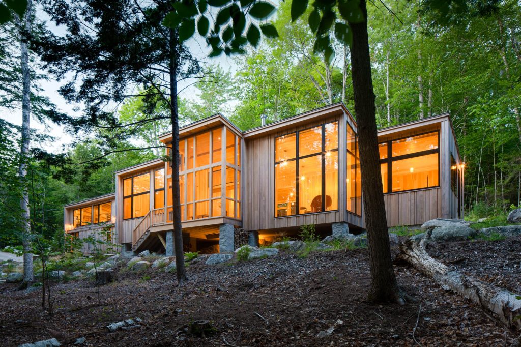
Likewise, foundational supports on many traditional camps consist of granite boulders found on site. (Often, they were built upon simply because it was easier than removing them completely.) Here, slender piers of native granite lift the structure above the topography. “We wanted to have a very light touch on the land,” William says.
Inside, the homage continues. “There’s not a stitch of drywall anywhere,” says William. “It’s all old-school exposed interior walls and ceilings—square-edged pine that will gap over time.”
There is also a take on the classic screened porch, although here it gets treated in towering glass. “Jamien St. Pierre, a local cabinet and furniture maker, built these incredible custom asymmetrical French doors for the screened porch,” William says. “They’re on pivot hinges. Pull a pin and they swing open, fix magnetically against the wall, and then you’ve got an unobstructed extension of the interior outward. It’s a seamless interior/exterior living experience.”
The soaring windows—perhaps the home’s most salient feature—were themselves a result of the conservation easement. “We could only build so high,” William explains. “We could have sandwiched on a second floor, but we decided to really let it breathe, to use all the height we were allowed on one floor. As a result, you get a downward view to the pond, but you also have this dramatic rise to the mountains. You can see the tops of mountains from inside. If we’d crammed on an upper floor, you never would have experienced that.”
Beyond a narrow breezeway, the space also includes a 900-square-foot barn. Here too, a traditional camp ethos reigns: the same randomized cedar siding, along with a classic rough-sawn framing. “Sustainability-wise, we’re trying to diminish the use of manicured finishes,” William says. “We don’t paint our exteriors. We don’t paint casings or trim. We put up honest materials and let them age gracefully.”
Maximalist Approach
Kennebunkport by Thomas & Lord
A home on the southern coast pushes the limits of scale
Location Kennebunkport, ME
Home Automation: SmartHome Solutions | Interior Design: Cebula Design | Landscape: Parker Landscaping | Plumbing: Jim Godbout Plumbing | Electric: Bridges Electric | Photography: Erin Little
There’s a line somewhere about “best-laid plans” that is apt for this Kennebunkport titan. What started as an 8000 square-foot design grew to over 14,000 square-foot by the time construction wrapped. “A lot was added along the way,” says builder Kevin Lord. These additions included a golf simulator, a wine cellar, theater, and butler’s quarters—to name a few. “These ended up filling the basement, which meant we needed room for the mechanicals, the components that actually run the home,” Kevin says. “We ended up adding a lot of structure to the living space below ground, under the patios, under the stairs. We couldn’t make the home any larger, but anywhere there was existing coverage, we were allowed to build below. A lot of the home we extended sub-grade.”
Creative problem-solving with regard to space limitations is further exemplified by the home’s unique and—for its size—notably shallow roofline. Height caps set by the town didn’t allow for steep pitches, “but the client was adamant about full-height, second-floor walls to maximize the rooms and space up there,” says Kevin. “That’s why you see these somewhat flattened roof pitches.” (They are still plenty steep enough to slough snow in winter.)
More bluntly: They couldn’t build up, so they built down.
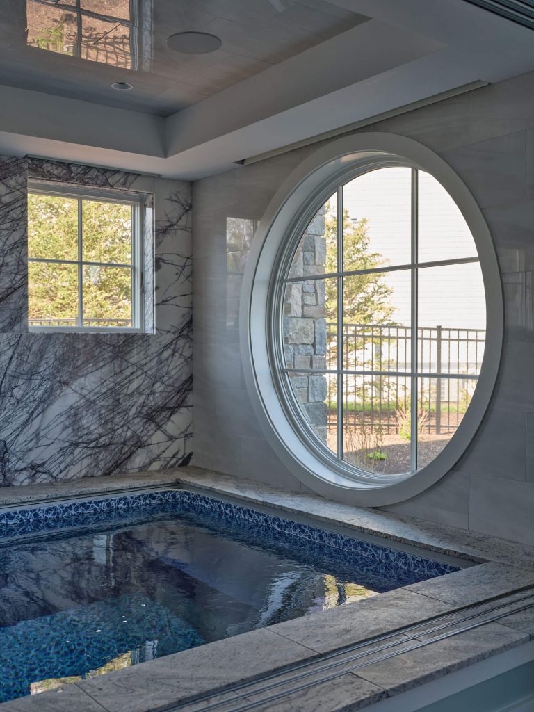
And the subterranean amenities are enviable. We especially admire the indoor pool and spa, complete with horizontal shower (that’s a thing?!), adjacent steam room, a seated section with multiple jets, and a central RainMoon shower by European manufacturer Dornbracht. The head (which looks like a giant eye in the ceiling) functions differently than a traditional rain-effect showerhead. Rather than individual streams, the RainMoon acts as more of a waterfall, dropping whole funneled sheets of cascading water onto the user.
Originally from India, the client imported full slab marble from the country for use in the spa and throughout the home. “The slabs were delivered in 40 by 120-inch spans,” says Kevin, also an owner of Maine Marble and Granite, a local stone fabrication shop. Again, the scale of the work was profound. “We put those slabs, one after another, on our CNC equipment, and they would cut tile for weeks on end,” says Kevin.
To be sure, both inside and out, the home is a study in maximalism. From the turrets, verandas, and expansive Marvin windows that characterize the exterior, to the divinely ornate ceiling ornamentation that touches almost every room. “The complexity of the interior ceiling details is significant—all those radial and curved beams,” Kevin says. “It was a lot to figure out the scale and dimension to bring that stuff to life.” The effort was certainly worth it. We know less is more has become somewhat of a design mantra these days, but here, decidedly, more is more.
HISTORY TAKE-TWO
Many historic homes in Maine have antique wicker placed within the interior, as well as old pieces that carry on through generations,” Melanie Millner says, reflecting on her renovation of this late 19th century Fred Savage shingle-style. “But this was a family new to the area, and they envisioned their interiors to have a fresh perspective.”
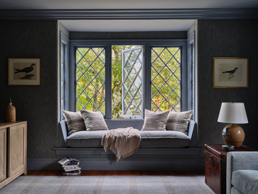
This new vision was initiated from the base layer. “We started with the rugs,” says Melanie. “We chose hand woven rugs with warm, soothing colors that provided a blanket of texture to each room…. The clients didn’t want a lot of patterns. Texture, yes, but not much pattern.” For instance, notice the den walls, upholstered in a fabulous gray-blue fabric that soothes on sight and dampens traffic noise from a nearby street.
Melanie also removed a three-story chimney in order to open sightlines to the water and create a more functional living room, adding a window seat where the fireplace once stood and two swivel chairs able to face the water or angle back into the interior. “In the late 1800s to early 1900s, the climate was much cooler in the summer months and fireplaces were essential to keep the house warm on cool foggy days. Now that Summers are much warmer, harbor views have become the main focus of this home,” Melanie says. “We did, however, make sure to put the original mantle into the hands of an architectural historian.”
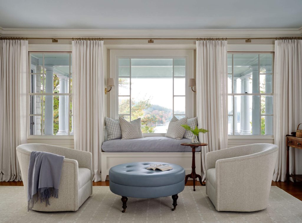
Without a lifetime of heirlooms to fill the space, the clients were happy to incorporate a mix of antiques and more contemporary pieces. The midcentury armchair adds a collected look, while the existing dining room table was kept for its perfect size and scale. “There isn’t a lot of ornamentation here like you’d expect in a historic home,” says Melanie. “Just classic clean lines, tailored upholstery, and comfort. You can put your feet up anywhere.